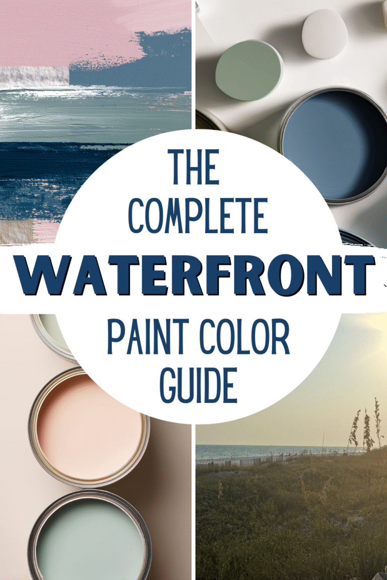
5 Coastal Living Room Color Palettes Inspired by Destin and the Emerald Coast
Living near the water has completely changed the way I think about color in my home. As someone who spends time along the beaches of Destin, Scenic 30A, and throughout the Emerald Coast, I’ve learned that coastal color palettes aren’t about decorating with bright blues everywhere or leaning into a nautical theme.
Instead, they’re about capturing a feeling of calm, light, and effortless, the same feeling you get the moment you step onto sugar-white sand and see that unmistakable turquoise water stretching out in front of you.
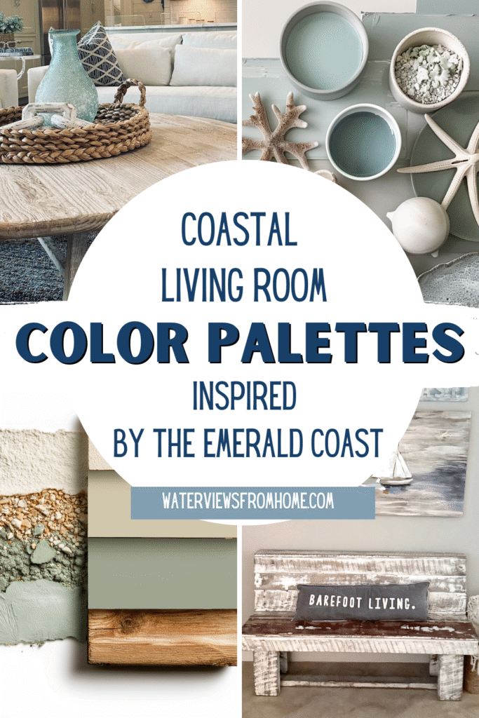
Coastal Living Room Color Palettes Inspired By The Emerald Coast
In this guide, I’m sharing the coastal palettes inspired by Destin and the Emerald Coast that I return to again and again in my own interior design work.
These color choices feel timeless and peaceful, and flexible enough to work in both coastal and lakefront spaces, making them perfect for creating a home that always feels like a retreat, whether it’s a Florida beach home, a suburban house, or anywhere in between.
Why Destin & the Emerald Coast Are the Perfect Color Muse
One of the things that makes this area so special is its natural beauty and effortless cohesion. The Emerald Coast doesn’t overwhelm you with bold contrast. Instead, everything feels layered, soft, and serene:
- Pale aqua and emerald water
- Powdery white sand
- Weathered driftwood tones
- Soft dune grasses and palms
- Gentle pastel sunset skies
When I design rooms inspired by this region, I always start with what I see outside large windows, not what’s currently on-trend. The result is a coastal color palette grounded in nature rather than trend cycles, something that works just as beautifully in Florida homes as it does in lake houses or Southern interiors.
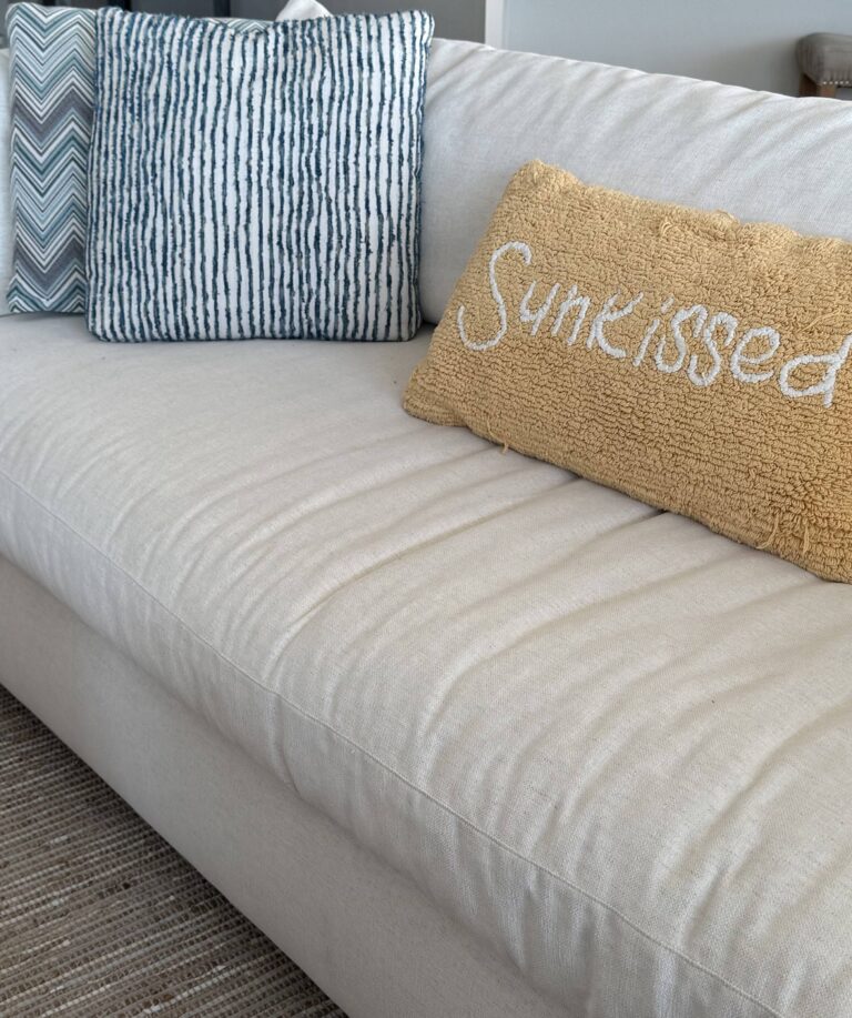
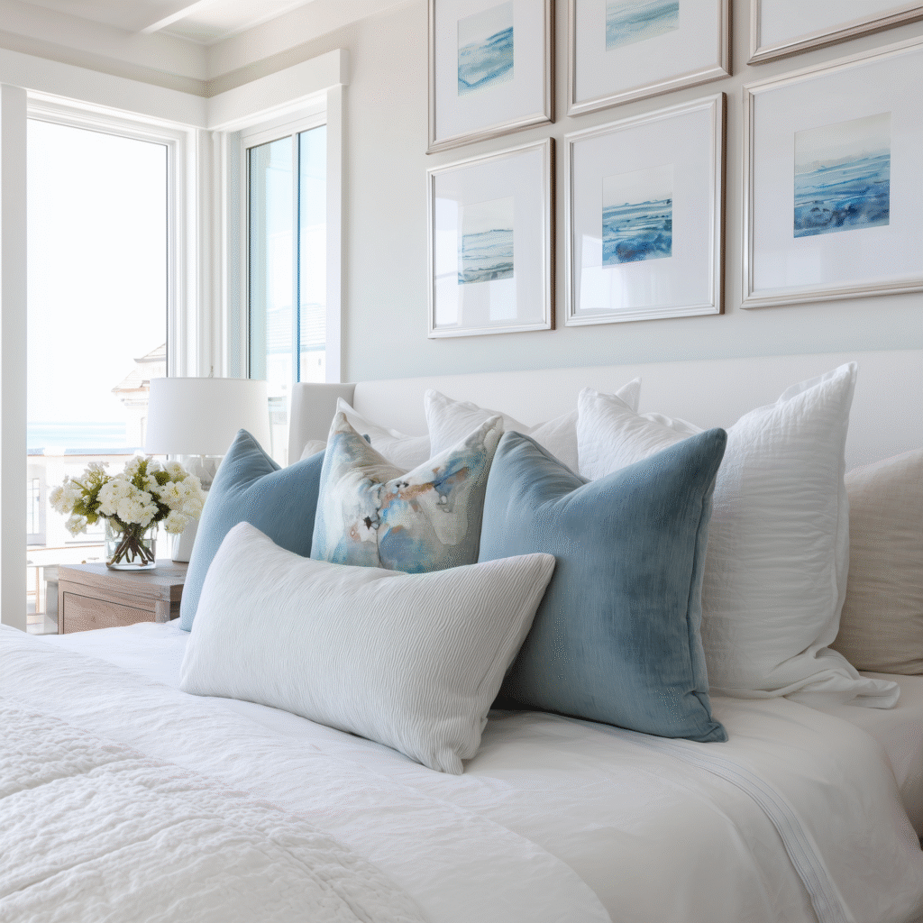
Palette 1: Soft Aqua + Warm White
(Inspired by shallow Gulf waters on a calm morning)
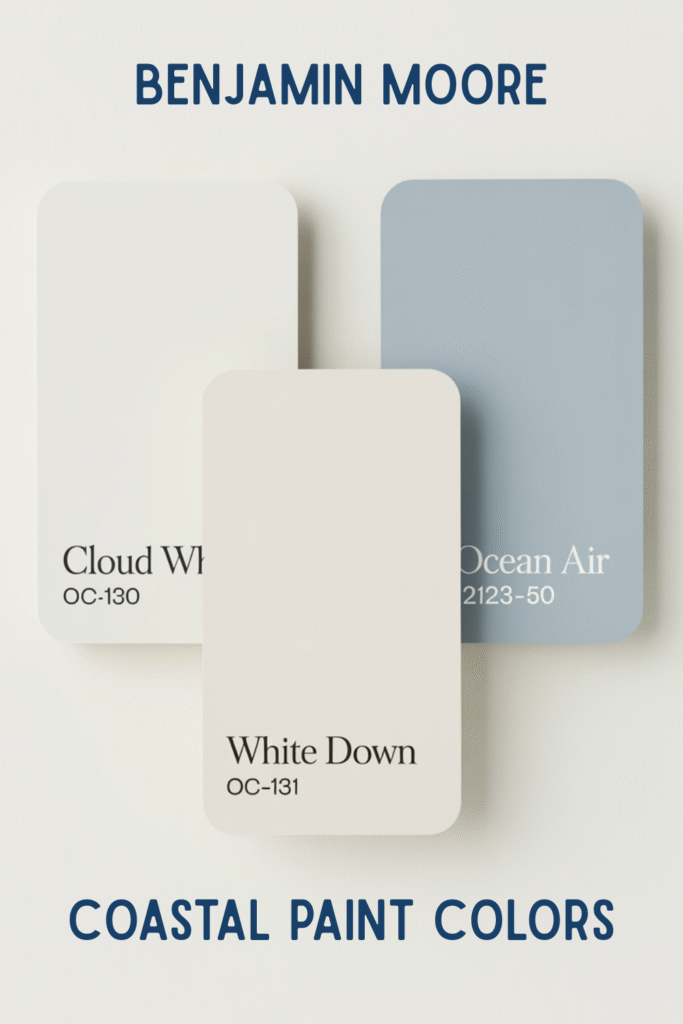
For this palette, my favorite coastal paint colors from Benjamin Moore are Ocean Air (2123-50), Cloud White (OC-130), and White Down (OC-131). This is the palette most people imagine when they think of coastal living, but the key is to keep it soft, airy, and beach-inspired rather than overly beachy.
How I use it:
- Warm whites for walls, white trim, and large furniture
- Soft blue-green tones in pillows, art, or subtle accent pieces
- Natural wood and breathable textiles like linen and cotton
This combination instantly makes a space feel breezy and open, especially in rooms filled with natural light. It’s one of my favorite choices for living rooms and bedrooms because it delivers calm and serenity without overwhelming the space.
Tip: I avoid pairing aqua with stark, crisp white. Creamy tones or a clean white with a warm undertone feel closer to sand and sunlight. Sherwin-Williams also offers several whisper-light coastal paint color options that work beautifully here, such as Alabaster and
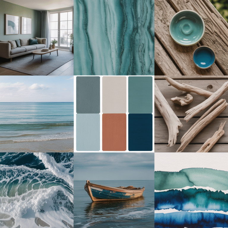
Palette 2: Emerald Green + Sand Neutrals
(Inspired by deeper water and dune grasses)
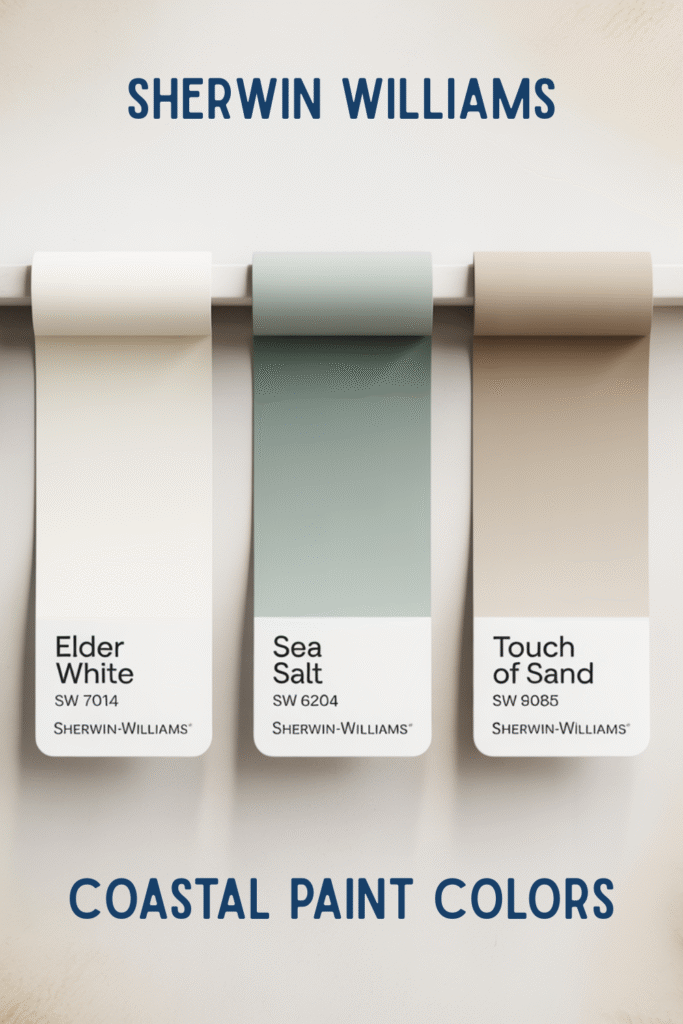
This palette has a grounded elegance that feels unmistakably coastal without being obvious. It works beautifully in both beach homes and lakefront properties. My favorite colors in this category include Elder White (SW7014), Sea Salt (SW 6204), and Touch of Sand (SW 9085).
How I use it:
- Sandy beiges and neutral tones as the foundation for walls, rugs, or upholstery
- A deep green hue or teal as the primary accent
- Warm natural wood furniture to balance cool tones
This palette brings sophistication while maintaining that laid-back coastal style. It’s especially effective in dining rooms, offices, or cozy sitting areas where you want depth without heaviness.
Tip: Stick to one dominant green per room and repeat it subtly for cohesion. Small pops of color, a ceramic vase, sea-glass décor, or artwork, help the colors shine without making the space feel busy.
Palette 3: Driftwood Gray + Soft Blue
(Inspired by weathered docks and overcast beach days)
Not every coastal palette needs sunshine. Some of the most beautiful days along the beaches of the Florida Gulf Coast are quiet, gray-blue mornings, soft blues, deep blues on the horizon, and a reflective calm water surface.
How I use it:
- Driftwood gray furniture or rugs
- Soft blue textiles and art
- Layered neutral hues to keep the room warm
This palette suits modern or transitional interior styles particularly well. It feels calm, understated, and versatile, perfect for homeowners who want coastal without obvious beach motifs.
My Favorite Driftwood grey and soft blue paint colors are Drift of Mist (SW 9166), Silver Strand (SW 7057), and Topsail (SW 6217).
Tip: Always add warmth with natural elements like jute rugs, woven baskets, or wood accents. Without those, gray can feel cold rather than serene.
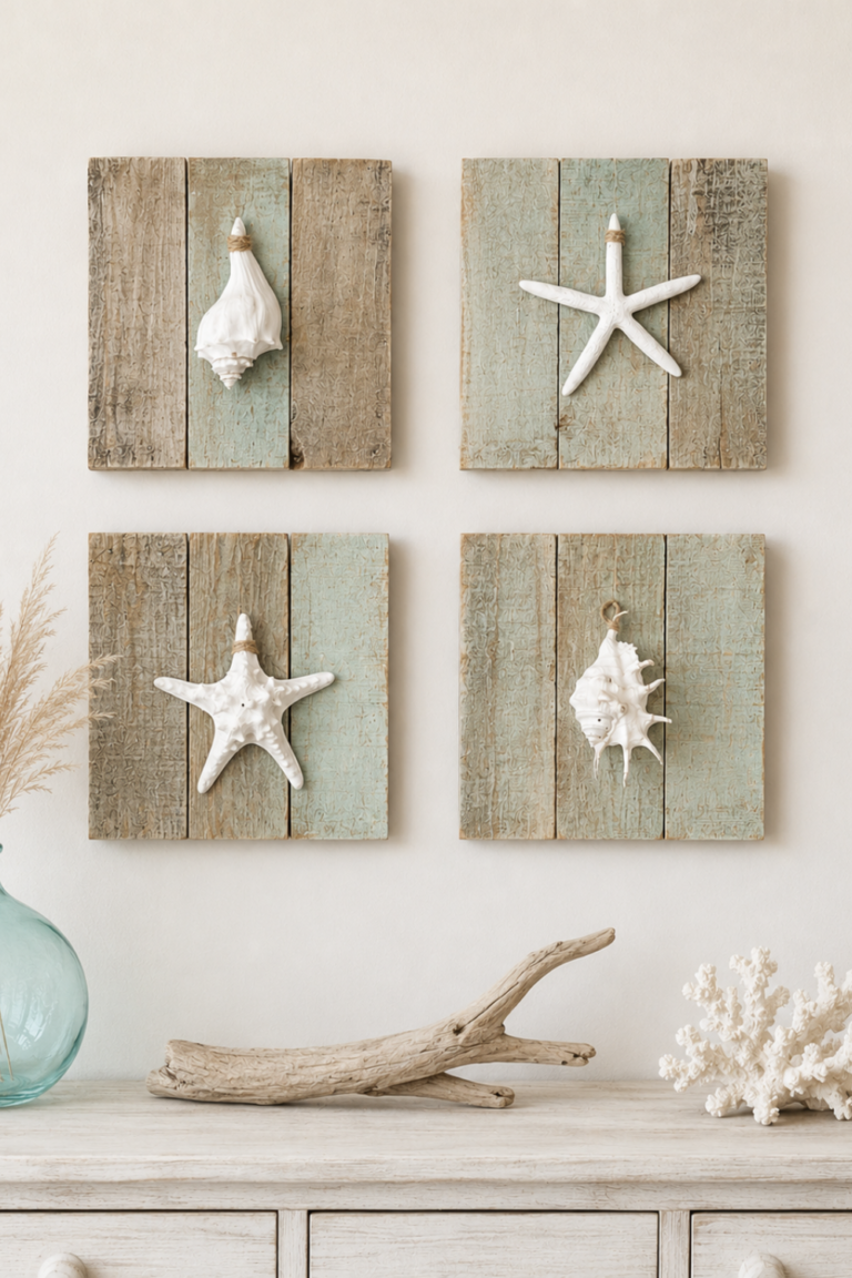
Palette 4: Seafoam Green + Pale Wood
(Inspired by dune lakes and coastal grasses)
Seafoam, especially when it leans slightly gray, instantly signals coastal color without shouting it. Paired with pale wood, it creates an organic look that feels fresh and peaceful.
How I use it:
- Seafoam or soft greens in bedding, pillows, or an accent wall
- Light wood furniture and flooring
- Plenty of white surfaces to keep things airy
This palette works beautifully in bathrooms, kitchens, and guest bedrooms. In kitchens, it pairs especially well with white cabinetry, stone countertops, and light flooring for a relaxed coastal interior that still feels sophisticated.
Tip: Avoid minty undertones. A muted blue-green or sophisticated shade with a gray base feels far more natural.
Palette 5: Sunset Pastels + Coastal White
(Inspired by evenings along Scenic 30A)
Sunsets along the Emerald Coast, and even farther south toward the Florida Keys, are soft, painterly, and full of gentle color transitions. Blush pinks, warm peach, pale lavender, and soft gold reflections create a palette that feels warm without heaviness.
How I use it:
- Coastal white is the main backdrop
- One or two pastel hues as accents
- Minimal patterns for a refined, tranquil look
This palette is perfect for seasonal updates, artwork, or decorative accessories. It adds warmth and elegance while keeping the overall space light and calm.
Tip: Keep sunset tones limited to accessories so the room remains timeless and adaptable year-round.
How I Choose the Right Coastal Palette for Each Room
When decorating any space, whether a Tampa Bay condo, a Florida beach home, or a suburban house, I ask myself three key questions:
- How much natural light does this room get?
- Do I want this space to feel energizing or serene?
- Will this palette work year-round?
Rooms with abundant sunlight can handle cooler hues like aqua, teal, or soft blues. Cozier spaces often benefit from warmer neutrals, beige tones, or soft greens to add warmth.
The goal is always the same: creating a sense of calm and connection to the water, even if you’re miles from the beach.
Making Coastal Colors Work Beyond the Beach
One of the reasons I love coastal-inspired palettes is their adaptability. You don’t have to live on the Gulf Coast to use them.
These colors work beautifully in:
- Lakefront homes
- Southern interiors
- Urban apartments craving serenity
- Florida homes outside traditional beach zones
By focusing on layered tones, natural materials, and subtle contrasts, you can achieve a coastal living style anywhere. It’s not about copying a theme; it’s about translating the feeling of water, sky, and sand into everyday spaces.
Decorating with a coastal color palette inspired by Destin and the Emerald Coast isn’t about recreating a stereotypical beach house or following a passing trend. It’s about capturing natural harmony, light, and layered hues that reflect the beauty outside your windows and support your personal style.
For me, color is always the starting point. When the palette is right, everything else falls into place, and your home begins to feel like your favorite place by the water.