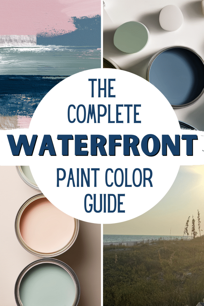
The Complete Waterfront Home Color Guide
After spending years decorating between coastal settings and a lake house, I’ve learned that the most beautiful waterfront interiors aren’t defined by trend cycles or a single paint color. They’re defined by feeling.
The best palettes reflect water, sky, sand, trees, driftwood, and the natural textures surrounding them, and I have included the exact paint colors that I use and love.
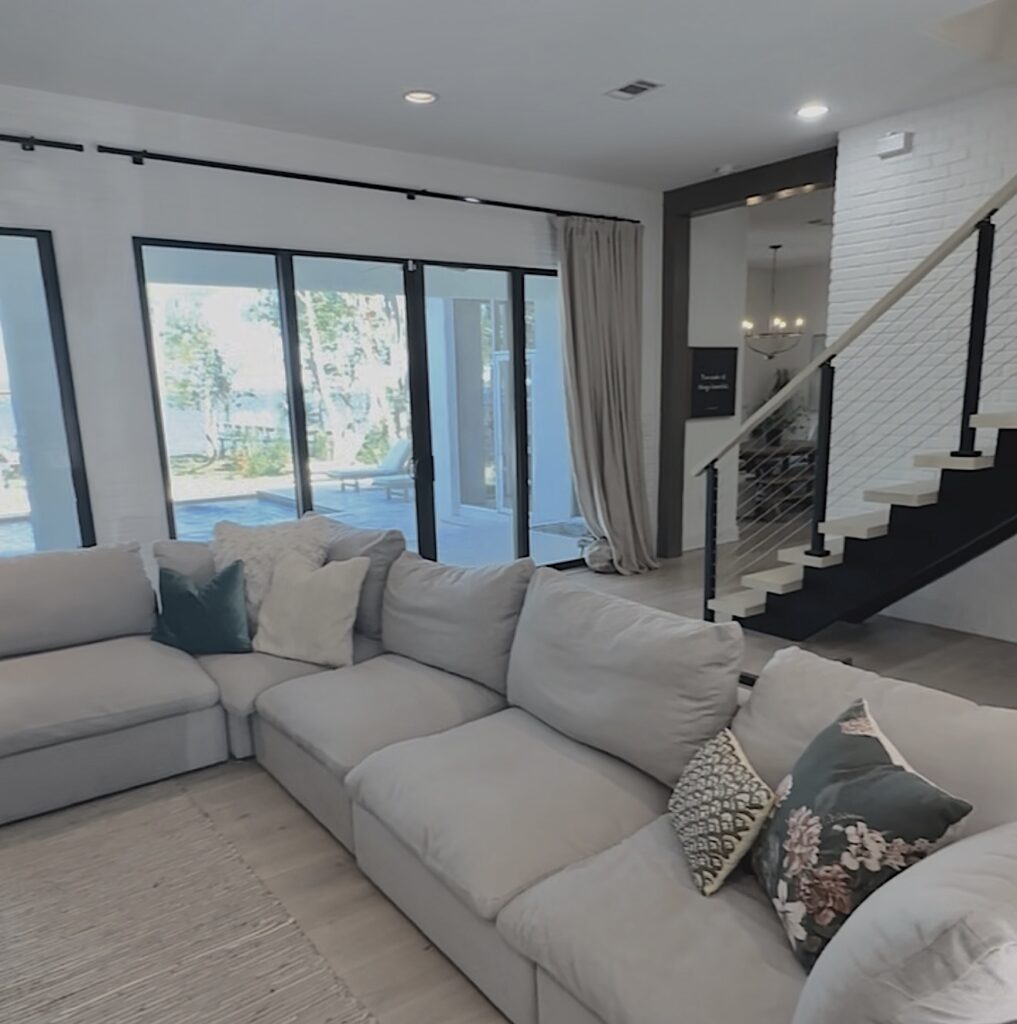
Designing a home by the water changes the way you think about color. Natural light reflects differently. Rooms feel more connected to the outdoors. The goal shifts from decorating a space to shaping an atmosphere, one that feels calm, restorative, and grounded in nature.
Lake house color palettes, coastal tones, and timeless waterfront home décor.
The Complete Waterfront Home Color Guide
This guide brings together everything I use when designing rooms inspired by water, from lakehouse palettes to coastal tones to the foundational principles of waterfront home décor.
Whether your home overlooks a lake or the ocean, or simply draws inspiration from a lake or beach-house lifestyle, this framework will help you create spaces that feel timeless and serene.
Why Waterfront Homes Require a Different Approach to Color
Color behaves differently in homes near water. Sunlight bouncing off the surface outside creates shifting hues throughout the day. Blues become softer. Whites feel warmer. Greens feel more organic. Colors appear muted in bright daylight and warmer during sunset.
The landscape, sandy shores, greenery, docks, siding, and shoreline textures become part of the interior, whether you plan for it or not. This is true for both the interior and exterior of the house.
Because of this, high-contrast palettes and trend-driven paint colours often feel out of place. Bold navy walls, heavy rustic finishes, or bright tropical accents can overwhelm the subtle beauty of a waterfront environment.
These spaces feel best when they:
Prioritize calm over drama
Reflect natural tones
Embrace softness instead of contrast
Use texture instead of bold patterns
Maintain cohesion from room to room
The goal is not to create a “beachy” theme or nautical display. The goal is to create a space that mirrors the emotional experience of being near water.
The Emotional Foundation of Waterfront Color
Before choosing paint samples or décor, it helps to understand what waterfront color is meant to do. The goal is not “lake-themed” or “coastal-themed.” The goal is calm.
These color schemes should:
Lower visual stress
Create flow between rooms
Feel breathable and light
Age well over time

This is why the most successful interior design plans avoid temporary trends and instead lean into tones found in nature, sandy neutrals, soft gray, soft blues, taupe, greiges, and muted beiges.
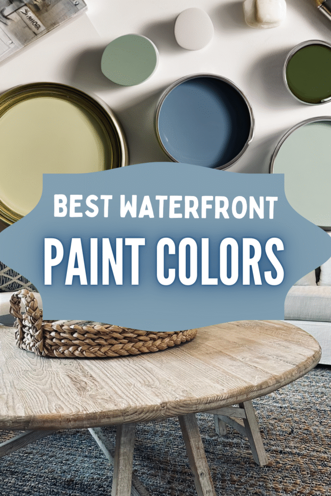
The Core Neutrals Every Waterfront Palette Begins With
No matter where your home sits, on the coast, by the lake, or inland, every scheme starts with foundational tones. These colors carry the space and allow accent colors to breathe.
Warm Whites – My Favorite Warm Whites are Alabaster (SW 7008) by Sherwin-Williams and Simply White (OC-117/2143-70) by Benjamin Moore
The backbone of most waterfront interiors. Soft white paint reflects natural light and prevents rooms from feeling sterile. Not stark, not icy, just a gentle off-white glow.
Sand & Beige – My Favorites are Accessible Beige (SW 7036) by Sherwin-Williams and Benjamin Moore Manchester Tan (HC-81)
These hues ground a space and echo shoreline textures. Beige and sandy neutrals bring warmth without heaviness and work beautifully with wood tones.
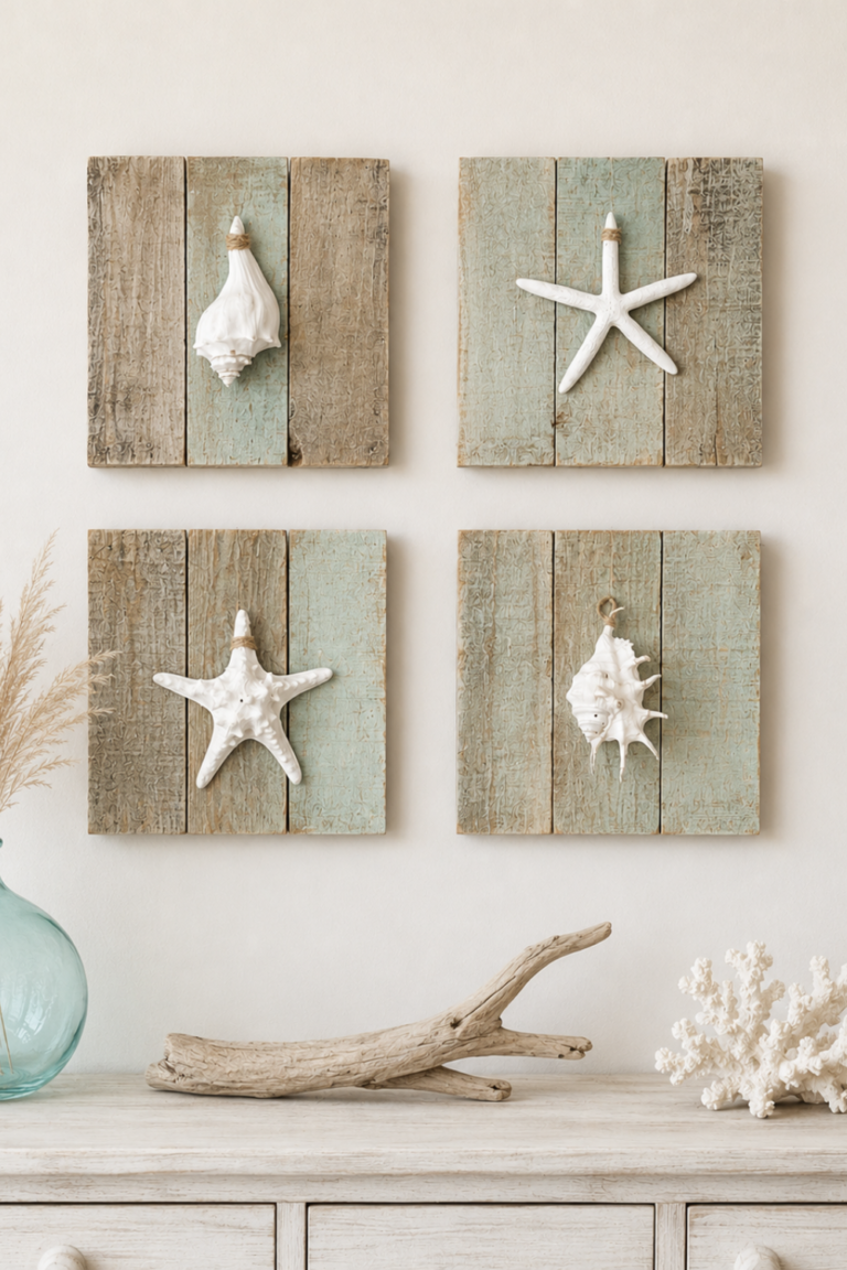
Driftwood Gray – This is not a stark gray but a brownish-gray that highlights the outdoor elements. My favorite choices include Drift of Mist (SW 9166) by Sherwin-Williams and Cloud Cover (OC-25) by Benjamin Moore.
A grounding mid-tone neutral that works in both modern and traditional homes. It pairs especially well with shiplap walls and crisp white trim in eggshell or semi-gloss finishes.
Blues and Muted Greens – I own a condo in Destin, FL, and the bedrooms are painted Sea Salt (SW 6204) by Sherwin-Williams, a classic color that always works in waterfront homes.
Light Natural Wood
Pale oak, pine, and weathered wood finishes connect interiors to docks, boats, and outdoor structures. These tones prevent spaces from feeling overly polished or artificial.
Without this base, coastal tones or lake tones can feel disconnected. With it, everything feels balanced.
Understanding Lake House Color Palettes
The best lake house color palettes are warm, natural, and grounded, drawing directly from the surrounding landscape. Think of the deep greens of tree lines, the soft blues reflected on still water, the texture of aged docks and natural wood, and the subtle shifts that happen from season to season.
These environments naturally inspire a scheme built on muted blues, moss and olive greens, warm whites, weathered wood tones, and soft charcoal accents. Together, these colors create a space that feels calm and connected to nature without feeling overly themed.
A well-designed lake home should feel cozy but never dark, natural without leaning too rustic, and layered with intention rather than cluttered with décor. Modern lake design has moved away from the heavy cabin aesthetic of dark woods and deep reds, embracing instead lighter, more breathable schemes that reflect natural light, soften interiors, and create a relaxed, timeless atmosphere.
The best lake house combinations lean slightly warmer and more grounded than coastal ones, but they follow the same guiding principles.
Signature Lake House Colors
Muted blues
Soft moss greens
Warm whites
Weathered wood tones
Charcoal accents
These reflect tree lines, lake water, dock materials, and seasonal changes. The atmosphere is cozy but still light.
Modern Lake Homes vs Traditional Cabins
Today’s lake homes are shifting away from heavy rustic interiors. Instead of deep reds and dark woods, modern schemes focus on:
- lighter finishes
- breathable neutrals
- soft textures
This shift keeps interiors from feeling dated and allows the architecture and views to shine.
For exterior colours for a lakehouse, softer siding tones, taupe, warm gray, sandy beige, or muted blue, blend more naturally with the landscape than stark white or deep hues.
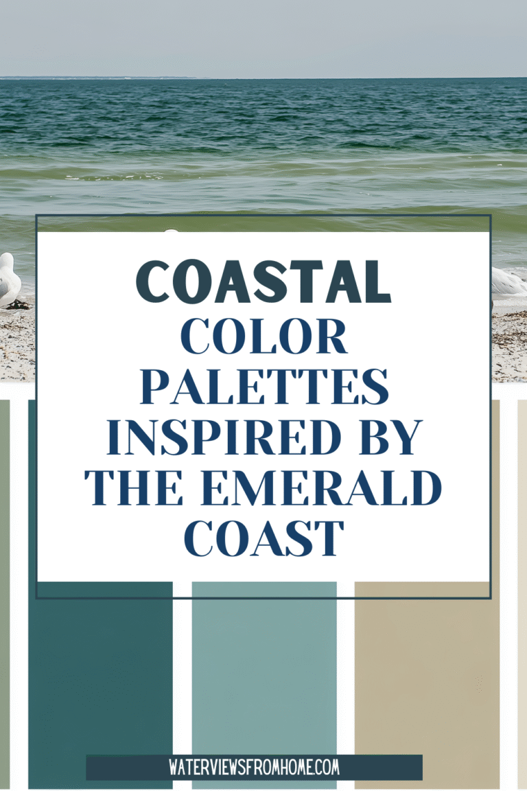
Coastal Color Palettes: Light, Airy, and Layered
Coastal interiors are often misunderstood. True coastal schemes aren’t bright or overly beach-themed. They’re soft and atmospheric.

When most people think about coastal design, they imagine bold blues, nautical stripes, and bright beach-themed décor. But true coastal style is much more refined.
The most timeless interiors inspired by the shore are built around soft, atmospheric combinations rather than loud or overly beachy tones.
A true coastal scheme reflects what you actually see at the water’s edge: gentle color shifts, natural textures, and light that changes throughout the day. Instead of relying on obvious beach themes, these schemes are rooted in nature and designed to feel calm, effortless, and enduring.
Key sources of inspiration include:
Soft tones of shallow water
Pale hazy skies
Dune grasses
Weathered textures
Sandy shores
These influences create the essence of coastal design — calm, airy, and enduring.
Core Coastal Colors That Feel Timeless
At the heart of every successful coastal scheme is a group of tones that work together to create balance and calm.
Sea Salt Green
Soft and muted, sea foam reflects the gentle green tones of coastal waters and greenery.
Pale Aqua & Turquoise
Inspired by shallow shorelines, these hues add freshness without overpowering a room.
Soft Sky Blue
A calming tone that works beautifully in bedrooms and living areas.
Warm White
Keeps coastal homes bright without feeling clinical.
Sand Tones
Ground the scheme and balance cooler hues.
Together, these form a versatile color scheme suitable for both interior and exterior paint applications.
Why Soft Coastal Colors Work So Well in Homes
These colors succeed because they create atmosphere rather than decoration.
Soft coastal schemes:
make rooms feel brighter without being stark
create calm, breathable interiors
layer easily with natural textures
remain timeless through changing trends
They feel light and effortless because they are drawn from real environments rather than manufactured color schemes.
How to Use Coastal Colors in Your Home
The key is restraint. Choose a neutral base, then layer one or two accent colors.
Start with:
- warm white walls
- sand-toned furniture or rugs
- natural wood textures
Then layer in:
- seafoam accents
- pale aqua pillows
- soft blue artwork
This approach keeps a space cohesive and calming.
The Difference Between Coastal and “Beachy”
One of the biggest misconceptions in design is the confusion of coastal style with beach décor.
Beach-themed interiors often rely on:
- bold navy tones
- anchors and stripes
- bright tropical colors
True coastal interiors feel:
soft
neutral
nature-led
timeless
They’re inspired by the environment and not by souvenirs or seasonal trends.
Creating a Coastal Palette That Lasts
When building your own coastal scheme, think in terms of how it feels rather than exact color formulas.
Ask:
Does this color feel calming?
Does it reflect water, sky, or shoreline?
Will it still feel beautiful in five years?
If the answer is yes, it belongs in your scheme.
Where Lake and Coastal Palettes Overlap
The overlap between lake-house and seaside hue combinations defines the heart of timeless home décor.
Both styles rely on the same foundational elements: light, soft color transitions, layered basics, and minimal contrast, to create spaces that feel connected to the outdoors. Instead of bold statements or heavy themes, these schemes focus on balance and atmosphere, allowing rooms to feel open and effortlessly cohesive.
Whether designing a cottage, pool house, or dream home, the emotional outcome is the same: spaces that feel calm, restorative, and connected to nature.
Room-by-Room Waterfront Color Strategy
Living Room
Best palette: warm white + sand + soft blue
Why it works:
Living rooms anchor the home. Soft blues reflect water, neutrals keep the space welcoming.
Styling tip:
Use color in accessories rather than large furniture pieces.
Bedroom
Best palette: driftwood gray + warm white + muted blue
Why it works:
Bedrooms benefit from low contrast and soft layering.
Styling tip:
Focus on texture — linen, woven materials, natural wood.
Kitchen
Best palette: white + seafoam + pale wood
Why it works:
Maintains brightness while tying into water-inspired tones.
Styling tip:
Keeps the space bright while tying into water tones.
Bathroom
Best palette: sea glass green + warm white + sand
Why it works:
Creates spa-like calm, naturally suited to water environments.
Styling tip:
Keep decor minimal and texture-driven.
Guest Room
Best palette: warm white + soft pastels
Why it works:
Inviting and flexible year-round.
Styling tip:
Use removable accents for easy updates.
PRO-TIP: Common Waterfront Color Mistakes
Many homeowners unintentionally make rooms feel heavy or dated. Avoid choices that feel heavy or artificial:
- Too many blues in one room
- Navy-red nautical themes
- Stark white everything
- Bright tropical schemes
- Heavy rustic finishes
Subtlety is key.
My Personal Approach Living Between Two Waters
Living between coastal and lakeside environments changed how I design. I no longer separate styles — I design for waterfront living.
My process:
- Start with light neutrals
- Choose one water-inspired color
- Repeat it subtly
- Layer texture instead of pattern
- Keep the scheme timeless year-round
This approach keeps rooms calm and cohesive.
How to Build Your Own Waterfront Palette
Step 1 — Choose a Neutral Base: warm white, sand, or driftwood gray.
Step 2 — Select One Accent Tone: soft blue, muted green, or warm gray.
Step 3 — Add Natural Texture: wood, linen, ceramics, and woven pieces.
Step 4 — Repeat Color Gently: Pillows, art, small decor pieces.
Designing a waterfront home is less about choosing the perfect color and more about deciding how you want a space to feel: peaceful, light-filled, and connected to the outdoors.
When your paint color choices mirror the world outside your windows, the home begins to feel intentional rather than decorated.
And that is the heart of timeless home décor, creating spaces that capture your favorite moment by the water, every single day.